Creating a Text Logo

The first step is choosing and getting the software. I used Inkscape for this example. Typically
a GNU/Linux distribution has packages, but you can also get the
installers through the Inkscape home
page. (Installing software isn't covered in this article.)
Next, you need to select a font you like. There are dozens of fonts
installed when you put a distribution like Ubuntu on your computer.
There are many more fonts available. Some cost money. Others, like the
neat one in the logo, are available for free. In keeping with the idea
of software freedom, sharing, etc. I'm using a free font which is
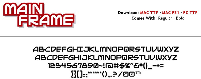
called MAINFRAME
BB.
The creator of the font is Nate Piekos who is also known as "Blambot"
which he uses as his nickname on Twitter. Besides doing comic book
lettering for a living, Nick makes fonts. He sells some, while he makes
others, like MAINFRAME BB, free to use as "freeware for independent
comic book creation and non-profit use ONLY." Natick FOSS qualifies to
use it. If we were going to publish commercial work, we'd need to buy a
license from Nate.
Part 1
Adding a font to your computer
(Ubuntu/Kubuntu).
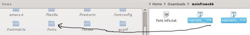
In your home folder, create a hidden folder, if the folder
doesn't already exist. The fonts in this folder will be available to
your login. It should be named .fonts
(note the leading period). To see the hidden folders in Kubuntu, start
Dolphin, the file manager program, navigate to your home folder and
while holding down the Alt key, tap the period key.Your hidden folders
will be revealed. For regular Ubuntu, try Ctrl+H to reveal the hidden
files. You may also want to read https://wiki.ubuntu.com/Fonts
for more details of this step.
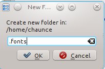
To make such a folder, right click the screen between current folder
icons. You will get a context menu which has the option to make a
New... (folder). Name it with a leading period.
.
Download the MAINFRAME
BB
font from the Blambot Web site. The link you want depends on your
computer. For this font on a Windows or GNU/Linux installation, the PC TTF is the link to click. TTF
stands for the most typically used format for fonts: TrueType Font.
Of course, if you were using a Macintosh, you would use that format.
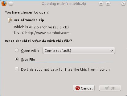
What you get when you click the link is the dialog for doing a
compressed file download. This dialog appears for me. I choose to save
the file (mark the appropriate button using the mouse. The default
location for this save is a folder called Downloads.
I get a Firefox Download message, telling me the file has finished.
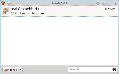
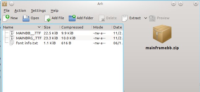
Next, I navigate to my Downloads folder and open the zipped
(compressed) file using Ark
which is the archive file tool on Kubuntu.
You can see that there are three files that have been packaged by
Blambot. There is a regular version of the font, a bold version and a
small text file describing the font license. All I need to do is click
the Extract button in the toolbar.
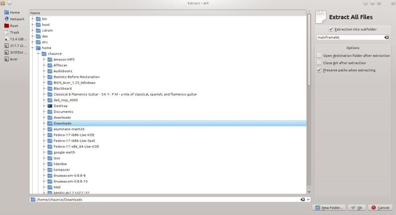
I choose to extract all the zipped files (which automatically creates a
folder for the zipped files) into the same Downloads folder. (I can
choose to keep or discard these files later. Maybe I'll want to share
the font with a friend.)
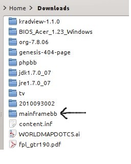
Here you can see the extracted folder, mainframebb.
The last step in preparing the font is to copy both the font (TTF)
files to the .fonts
folder you made earlier. My file manager (Dolphin) lets me split the
view so it is very easy to drag files between locations. If your file
manager shows only one view at a time, you may need to select the two
files using the Ctrl key to select more than one at a time, then copy
and, after switching to the .fonts folder, paste them.
Part 2
Creating the Logo
Once you have installed the font you want, you can use it in any
program which lets you select text. You could use the font in
LibreOffice, for example. This logo project is going to require more
precise control than that, so Inkscape is the way I choose to go.
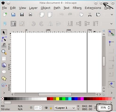
Start Inkscape.
Expand the window and view full size. It will be easier to see what you
are doing.
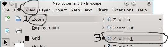
Zoom in this way, if you wish.
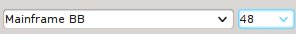
Change the font to Mainframe BB. (My default font is Liberation Sans.)
Make the font size 48 point or bigger.
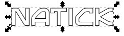
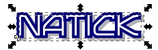
Type the word NATICK. It will be black by default. By default, there
will also be no border around the letters.

The control for Fill and Stroke (border) is at the bottom left corner
of the Inkscape window.
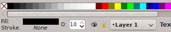
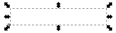
You want the fill to be white. Be alert. The word will disappear except
for the handles.
Just clicking the color block for white will give you a white word
(which will seem to disappear except for the handles.
Add a 4 point border (stroke) to the lettering. Change the border color
to navy blue, and change the letter fill to white. (controls at bottom
left of window
Right click the word "None" by the Stroke label in order to get the
following options. Choose black initially.
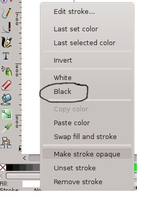
The automatic stroke thickness is 1 pixel. Right click the number to
get a long list of options. Choose 4.
To change the stroke color from black to blue, hold down the shift key
while clicking the navy blue color block.

Adjust the kerning (space between letters) to a minus 4.00 so the
borders of the letters bump into each other but don't overlap. The logo
looks better that way, I think.

The manual shadow is next. Duplicate the word. Change the new copy to
all gray, both the fill and the stroke.
Using the arrow keys, move the gray copy two steps right and two steps
down.

Finally lower the gray copy behind the colorful one.

Group the two copies of NATICK. Grouping means the word and its shadow
will stay in relative position while you manipulate them later.
In a separate text box, type the word FOSS in the same Mainframe BB
font, and make the kerning minus 6.00 for a tighter overlap (remember
there's no border).
You're not going to do the border this time.
Add a manual shadow effect as we did before.
Make a gray copy and shift two steps right and two steps down.
Lower the gray copy below the black copy.
Group the two copies of FOSS.
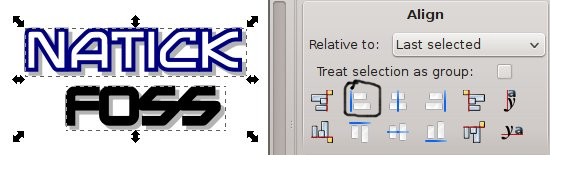
Slide the word FOSS up to just bump into the shadow of the word NATICK.
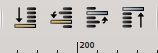
Left align the two grouped word groups.
Select one word by clicking on it. Then hold the shift key to select
the second as you click it.
The alignment will normally be made to the last element you select.
There it is.

Of course, Maybe you like an alignment to the right instead.

Thanks for following along.
Send comments. algot at runeman.org